
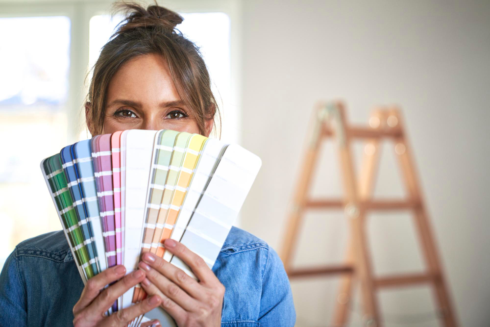
Color has the power to transform more than just the appearance of your home—it can fundamentally alter how you feel within those walls. Every shade carries psychological weight, influencing emotions, energy levels, and even productivity. When you step into a room painted in calming blues, you might notice your stress melting away. Walk into a vibrant yellow kitchen, and suddenly you feel more energized and optimistic.
Understanding color psychology isn't just about following design trends. It's about creating spaces that support your lifestyle, enhance your well-being, and make your home truly feel like a sanctuary. Whether you're planning a complete home makeover or simply refreshing a single room, the colors you choose will impact your daily experience in ways both subtle and profound.
The science behind color psychology reveals fascinating connections between what we see and how we feel. Research shows that certain colors can lower blood pressure, improve focus, or even boost creativity. This knowledge empowers homeowners to make informed decisions that go beyond aesthetic appeal, creating environments that actively contribute to their happiness and success.
How Colors Influence Our Emotions
The human brain processes color information before it registers shapes or text, making color one of the most immediate ways our environment affects us. This rapid response occurs because colors trigger specific neurological pathways that connect to our limbic system, the part of the brain responsible for emotions and memories.
Warm colors like red, orange, and yellow tend to stimulate and energize. They can make spaces feel more intimate and cozy, but they might also increase anxiety or restlessness when used excessively. Red, for instance, can raise heart rate and create feelings of urgency or passion. Orange promotes enthusiasm and creativity, while yellow stimulates mental activity and communication.
Cool colors such as blue, green, and purple generally have a calming effect. Blue can lower blood pressure and slow heart rate, making it excellent for bedrooms and spaces meant for relaxation. Green, associated with nature, promotes balance and reduces eye strain. Purple, particularly lighter shades like lavender, can encourage introspection and creativity while maintaining a sense of calm.
Neutral colors like white, gray, and beige serve as emotional anchors, providing stability and allowing other elements in the room to take center stage. However, even neutrals carry psychological weight—too much white might feel sterile, while excessive gray can seem depressing without proper accent colors.
Room-by-Room Color Psychology
Living Rooms: Creating Connection and Comfort
Living rooms benefit from colors that encourage social interaction while maintaining comfort. Warm neutrals like cream or soft taupe create welcoming atmospheres, while accent walls in deeper shades like navy or forest green add sophistication without overwhelming the space. Earth tones promote relaxation and make guests feel at ease.
Bedrooms: Promoting Rest and Intimacy
Bedrooms require colors that support quality sleep and relaxation. Soft blues and greens are scientifically proven to lower heart rate and promote restful sleep. Muted purples can create a sense of luxury while maintaining tranquility. Avoid bright reds or oranges in bedrooms, as these energizing colors can interfere with sleep patterns.
Kitchens: Encouraging Energy and Appetite
Kitchens thrive with colors that stimulate appetite and conversation. Warm yellows create cheerful cooking environments, while soft greens can make the space feel fresh and clean. Many successful kitchen designs incorporate white or cream as a base with colorful accents through backsplashes or accessories.
Home Offices: Enhancing Focus and Productivity
Home offices benefit from colors that enhance concentration without causing fatigue. Light blues can improve focus and calm the mind during stressful work periods. Green reduces eye strain during long computer sessions. Small amounts of yellow can stimulate creativity, but use it sparingly to avoid overstimulation.
Bathrooms: Creating Spa-like Serenity
Bathrooms become personal retreats when painted in calming colors. Soft blues and greens evoke water and nature, creating spa-like atmospheres. Warm grays can feel luxurious and sophisticated, while whites keep small bathrooms feeling open and clean.
The Impact of Color on Spatial Perception
Color profoundly affects how we perceive the size and proportions of a room. Light colors reflect more light, making spaces appear larger and more open. This principle explains why small rooms often benefit from white, cream, or pale colors on the walls. The increased light reflection creates an illusion of expanded space that can make cramped quarters feel more comfortable.
Dark colors absorb light, which can make rooms feel smaller but also more intimate and cozy. Deep blues, rich greens, or charcoal grays can transform a large, impersonal space into a warm, enveloping environment. However, using dark colors requires careful consideration of lighting and room size to avoid creating oppressive atmospheres.
Ceiling color dramatically affects perceived room height. Light-colored ceilings appear higher, while dark ceilings can make rooms feel more intimate but potentially cramped. Painting ceilings slightly lighter than walls creates subtle definition without stark contrast.
Color temperature also plays a crucial role in spatial perception. Cool colors tend to recede, making walls appear farther away, while warm colors advance, bringing surfaces closer to the viewer. Strategic use of this principle can help correct problematic room proportions.
Cultural and Personal Factors in Color Psychology
While color psychology provides general guidelines, personal and cultural associations significantly influence individual responses to colors. Someone who grew up in a blue bedroom might find that color particularly comforting, while another person might associate it with sadness based on different experiences.
Cultural backgrounds also shape color perceptions. Western cultures often associate white with purity and cleanliness, while some Eastern cultures connect it with mourning. Red signifies luck and prosperity in Chinese culture but might represent danger or aggression in other contexts.
When choosing paint colors, consider your personal history with different shades. Think about colors that make you feel happy, calm, or energized based on positive memories or associations. These personal connections often override general color psychology principles, making your individual response more important than universal rules.
Practical Tips for Implementing Color Psychology
Start with small color experiments before committing to major changes. Paint sample boards and observe them at different times of day and under various lighting conditions. Natural light, warm artificial light, and cool LED lighting can dramatically alter how colors appear and feel in your space.
Consider the primary function of each room and choose colors that support those activities. Active spaces like kitchens and home gyms can handle more energizing colors, while rest areas benefit from calming shades.
Balance is crucial when implementing color psychology. Even the most calming blue can feel monotonous without variation, while energizing yellows need neutral anchors to prevent overstimulation. Use the 60-30-10 rule: 60% dominant color, 30% secondary color, and 10% accent color for pleasing proportions.
Test paint colors in different lighting conditions throughout the day. Morning light, afternoon sun, and evening artificial light can make the same color appear dramatically different. What looks perfect at noon might seem too stark or too dull in evening light.
Transform Your Space with Expert Color Guidance
Understanding color psychology empowers you to create homes that not only look beautiful but also support your emotional well-being and lifestyle goals. The right colors can turn your house into a true sanctuary that enhances your daily life, improves your mood, and reflects your personality.
Professional painters bring valuable expertise to color selection and implementation. They understand how different paint finishes affect color appearance, which primers work best with specific color changes, and how to achieve the exact shade you envision. Their knowledge of color theory, combined with technical painting skills, ensures your color psychology goals become reality.
If you're looking for interior painters in Orlando, FL, contact Rusty's Painting today to request free estimates. Our experienced team can help you select colors that achieve your desired psychological impact while ensuring flawless application that brings your vision to life.